Account Dashboard: Secure account management for first responders and agency administrators
UX Research & Design Lead
A secure network built for first responders.
An account experience redesigned to match.
First responders and agency administrators needed fast access to billing, usage, devices, support, and account status. The dashboard needed to reflect their daily account tasks — not the enterprise account model it had inherited.
Built for the people who depend on it.
Improved task completion and usability across a network serving first responders nationwide.
"Excellent" range — above the 90th percentile on the System Usability Scale.
"Excellent" range on desktop, validated through unmoderated RITE testing.
First responder subscribers on the FirstNet network.
Public safety agencies served across the network.
The dashboard needed to reflect the daily account tasks of first responders and agency administrators.
The FirstNet dashboard had been built on AT&T's Premier platform — designed for large businesses managing hundreds of lines. First responders managing their own accounts needed something much closer to a consumer experience: fast access to bill pay, usage, AutoPay, devices, and account status.
35% of all sessions were bill payment attempts. The top 5 tasks — pay bill, setup AutoPay, view bill, shop, account management — accounted for 85% of traffic. The tasks that mattered most were the hardest to find.
Five inputs. Every one said the same thing: this is too hard.
User interviews, expert review, OpinionLab feedback, behavioral analytics, and audience segmentation all pointed to the same root cause — critical tasks were buried, navigation was counterintuitive, and page performance made everything worse.
"Billing and account set up are a real pain."
OpinionLab survey respondent
"There is no way to pay your bill online."
OpinionLab survey respondent
"The account site access and billing is sub-par."
OpinionLab survey respondent
Before
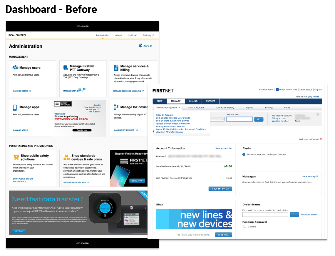
The inherited B2B account dashboard buried bill pay, usage, AutoPay, shopping, and account management behind layers of enterprise-oriented navigation.
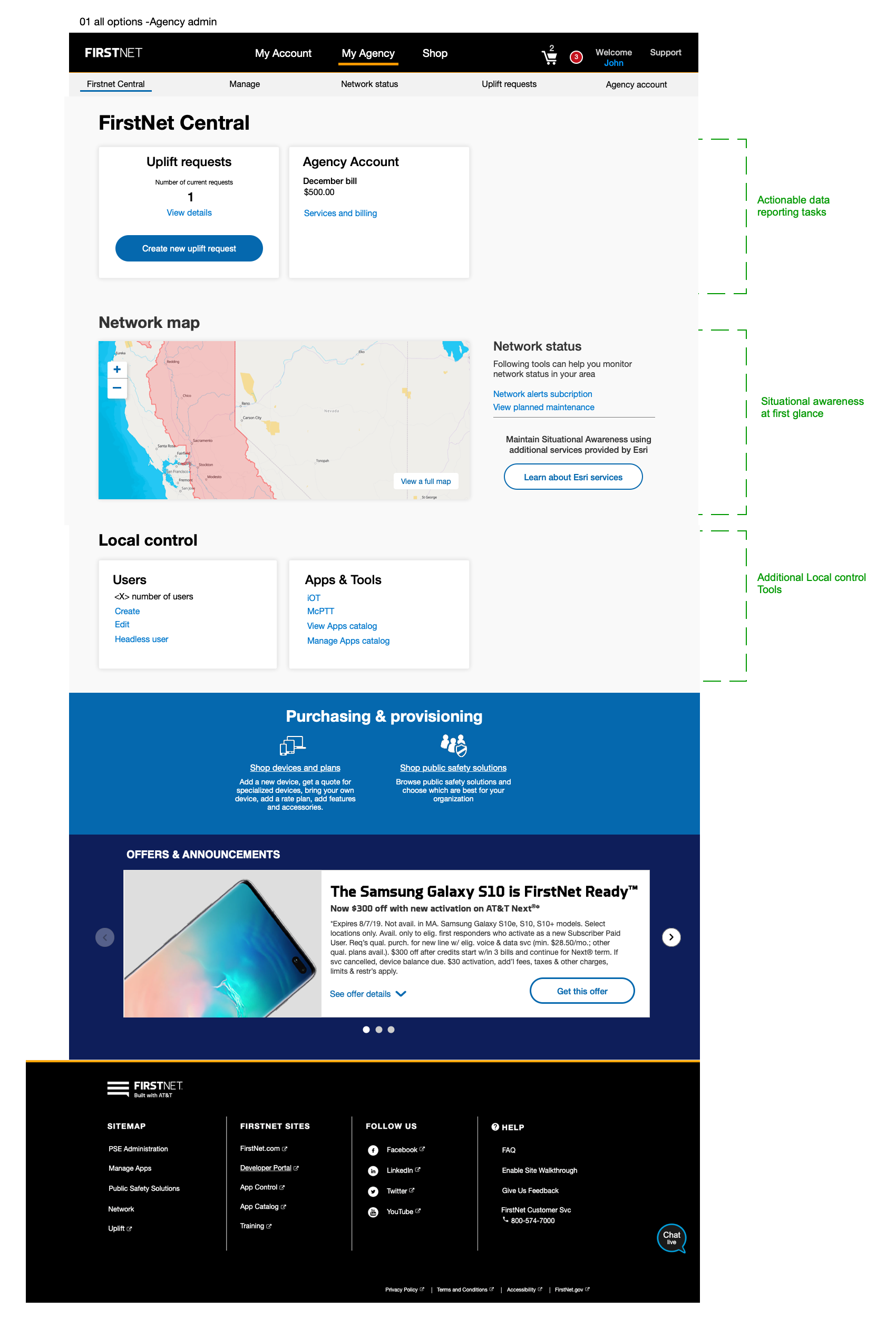
A modular dashboard built around the tasks that mattered most.
We reorganized the dashboard around the tasks users came to complete, not the internal account structure. The modular model surfaced high-priority actions, supported mobile and desktop use, and created a pattern that could extend to agency administrators.
Bring the tasks to the user. Don't make them navigate to find what 85% of them came to do. The dashboard is not a homepage — it's a task launchpad.
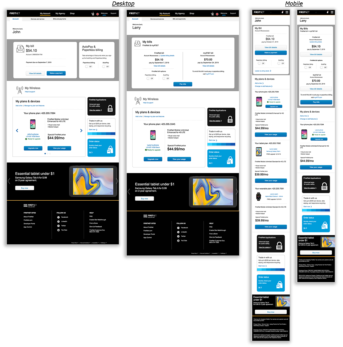
After — top tasks surfaced immediately, AutoPay status visible, role-appropriate account information across mobile and desktop.
SUS 95 mobile. SUS 91 desktop. Both "Excellent."
We validated through heuristic evaluation and unmoderated RITE testing — iterating quickly across multiple rounds before final build. Both scores landed in the "Excellent" range on the System Usability Scale.
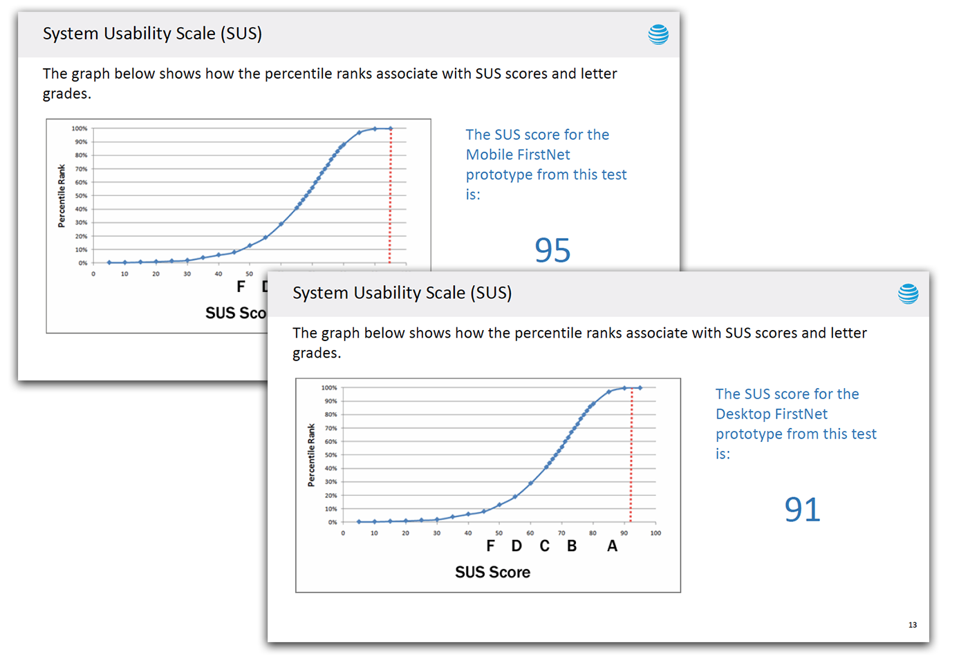
SUS scores and task completion data from the final validation round.
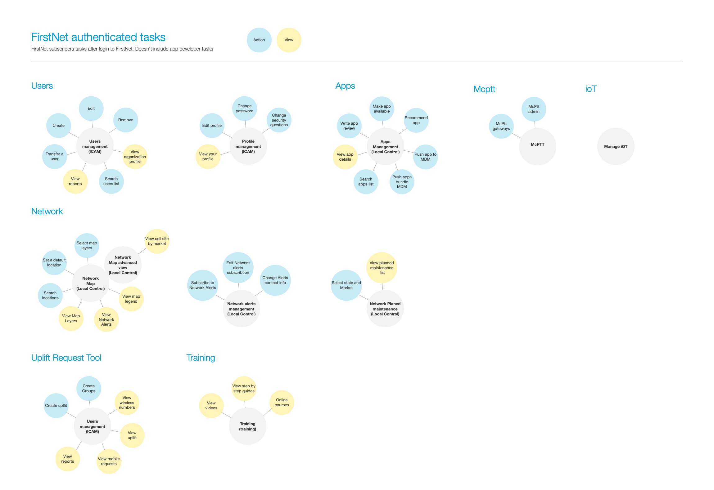
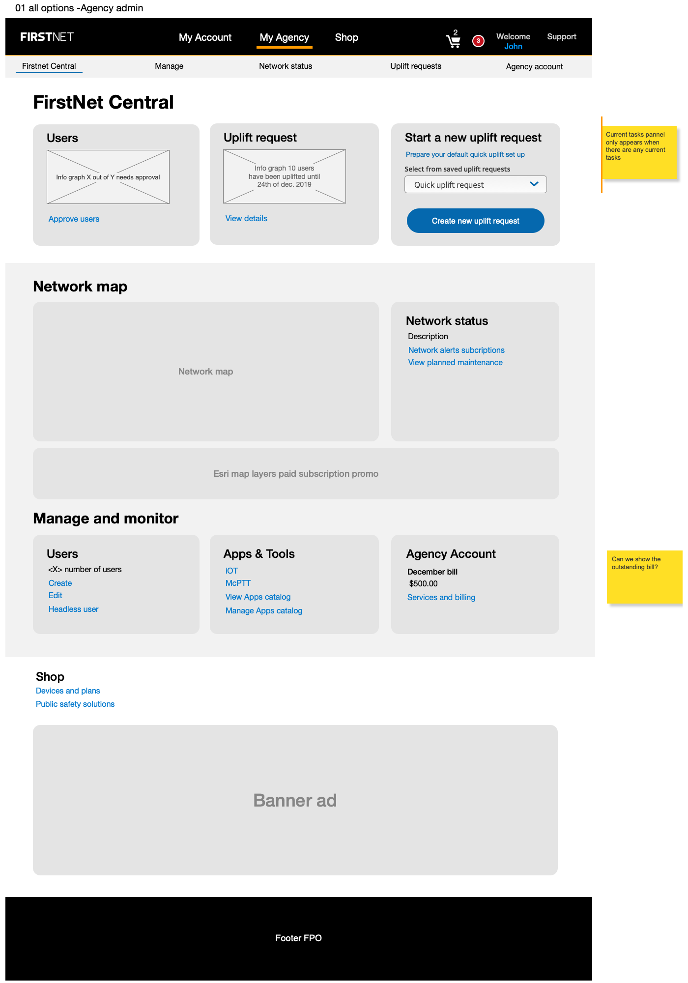
Extending the model to agency administrators.
The first phase focused on the 65% subscriber-paid use case. The next phase addressed agency administrators — a distinct user type with different permissions, billing models, and management needs. Supporting artifacts included task models, dashboard variants, responsive layouts, and administrator workflows.
What This Changed
The dashboard inherited a B2B account model that didn't match how subscriber-paid first responders used their accounts. Redesigning around the tasks they actually came to complete produced scores in the "Excellent" range.
SUS 95 mobile · SUS 91 desktop. An experience that finally matched the importance of the network it supports.